 |
||||||
    |
||||||
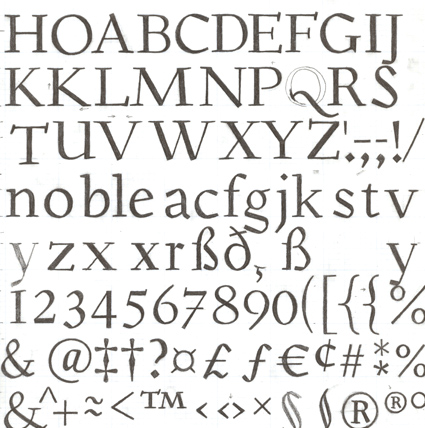
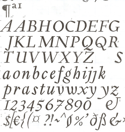
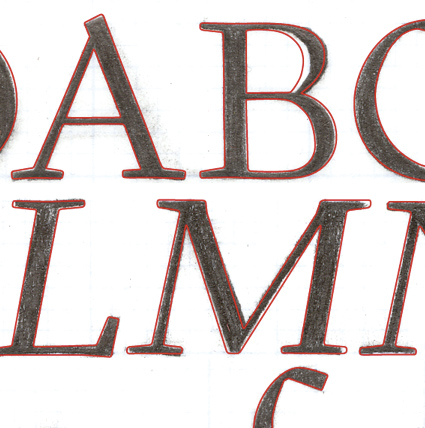
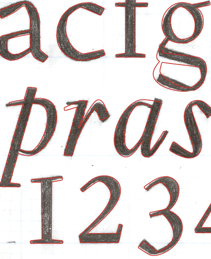
The idea for Gilman started simple enough, a serif typeface that works well for large amounts of text. However, after many struggles creating a quality typeface digitally, I decided to first draw the complete alphabet by hand on paper, and then trace that digitally. After that I tweaked a few minor areas on the computer that need changing. This unusual process resulted in a typeface that is not completely uniform, giving it a distinctly “human touch.”
|
|
|||||