 |
||||||
 |
||||||
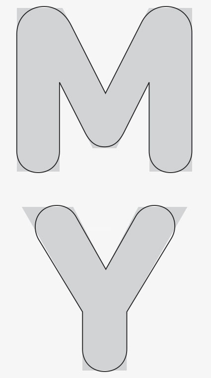
The execution of rounding a font may seem simple enough, but much care had to be taken to ensure each character looked its best. All terminals and joints are perfectly round, there are no flat spots even at wide joints like the M. The structure of some letters, like the Y, had to be altered so that they don’t appear too narrow.
|
|
|||||